

Speaking of bad logos
London is hosting the 2012 Olympics™, and today the organizing committee unveiled the official logo.
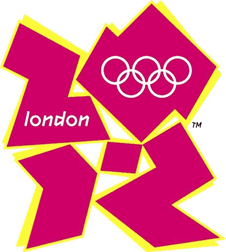
Here's what they had to say about it:
One can only hope.
Blazer, i'm sure, is thanking his lucky stars that he lives in Durham, NC, not Durham, England, these days. But the final word must belong to Gareth Cummins, who writes to the Guardian (London):
Here's what they had to say about it:
Available in four colours – pink, blue, green and orange - the new emblem is modern and will be dynamic, evolving in the years between now and 2012.
One can only hope.
Blazer, i'm sure, is thanking his lucky stars that he lives in Durham, NC, not Durham, England, these days. But the final word must belong to Gareth Cummins, who writes to the Guardian (London):
"A little off topic, but am I the only one who thinks that the new Olympics logo looks like Lisa Simpson going down on her brother?"
Labels: bad logos
 Since 1949, Durhamites have slept soundly, secure in the knowledge that, in our town, erection can be depended upon. Now, thanks to the power of the internets, we can spread that security all over the world.

1 Comments:
Holy cow. I was actually frightened by that.
By Anonymous, at 1:54 PM
Post a Comment
<< Home