

Affordability
Here's an interesting map i came across via DC Streetsblog
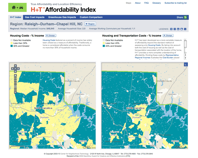
On the left, the area in yellow indicates that portion of Durham County where housing is considered "affordable" based on the traditional 30% of income metric, ie a family earning the median income will spend no more than 30% of income to live in median priced housing.
On the right, the yellow area shows the affordable portion of Durham County using a new housing + transportation < 45% of income metric. As you can see, that area shrinks considerably. Yet the blue areas on the map, especially to the north and east, are certainly those where much of Durham County's growth is going to come from over the next 20 years.
Food for thought.
Click here and play with the map to check out how pretty much any community in the US changes with the new metric.
Labels: development, Durham
 Since 1949, Durhamites have slept soundly, secure in the knowledge that, in our town, erection can be depended upon. Now, thanks to the power of the internets, we can spread that security all over the world.

0 Comments:
Post a Comment
<< Home